
Top 15 Online Learning Aesthetic Ideas, Backgrounds & UI Design Inspirations
In today’s digital world, how your online learning platform looks is super important. It’s not just about pretty pictures. A good design helps keep students interested and makes them trust your brand. When an interface is easy to understand, learners don’t have to work hard to figure it out. They can focus on learning instead. Think about it, people often decide if a platform is credible within seconds, just by looking at it. That’s why picking the right online learning aesthetic is a game-changer.

15 Online Learning Aesthetic Ideas
Minimalist Pastel Dashboard
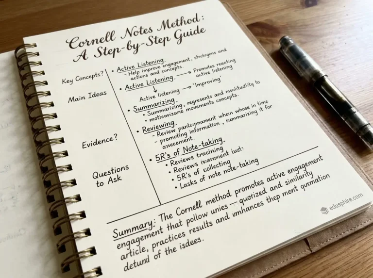
Imagine a clean, simple dashboard with soft pastel colors like light blue, mint green, or pale pink. It feels calm and organized. This style is great for platforms focused on well-being, creative arts, or beginner-level courses where a gentle introduction is key. read Cornell Notes Method: A Step-by-Step Guide.
Dark Mode Focus Theme
A dark mode theme uses deep blacks or charcoals with bright accent colors. It reduces eye strain, especially for long study sessions, and makes content pop. This is perfect for technical courses, coding bootcamps, or platforms where intense focus is required.
Nature-Inspired Calm Palette
Think earthy tones like greens, browns, and soft blues, perhaps with subtle leaf or water textures. This aesthetic creates a serene and grounding experience. It works well for environmental studies, mindfulness courses, or any subject aiming for a peaceful learning environment.
Glassmorphism Course Cards
This style uses frosted-glass effects for elements like course cards, making them look semi-transparent and layered. It’s modern and sleek. It suits tech-focused platforms or courses teaching design and digital skills, giving a sophisticated feel.
Retro-Futuristic Cyber Classroom
Picture neon accents, geometric shapes, and a blend of vintage sci-fi vibes with modern tech. It’s energetic and exciting. This aesthetic is ideal for gaming-related courses, digital art, or any program wanting to feel edgy and forward-thinking.
Warm Neumorphic UI
Neumorphism creates a “soft UI” look where elements seem to extrude from or be pressed into the background. It uses subtle shadows and highlights for a tactile feel, often in muted, warm colors. This works well for general education platforms or professional development courses seeking a friendly, approachable design.
Bold Gradient Hero Sections
Use smooth, vibrant color transitions in large header areas or banners. Gradients add depth and dynamism. This is excellent for marketing-heavy course pages, motivational content, or platforms aimed at younger audiences who appreciate bold visuals.
Hand-Drawn Illustrative Style
Incorporate custom illustrations that look hand-drawn, perhaps with a sketchy or watercolor feel. This adds personality and approachability. It’s a fantastic choice for children’s education, art classes, or courses focused on humanities and storytelling.
Clean Corporate Blue Theme
A classic choice, this uses various shades of blue with clean lines and plenty of white space. It conveys trust, professionalism, and stability. This is a go-to for corporate training, business courses, and professional certification programs.
Playful Gamified Interface
Think bright colors, progress bars that look like game levels, badges, and fun icons. This design makes learning feel like a game. It’s perfect for K-12 education, language learning apps, or any platform that wants to boost engagement through gamification.
Monochrome Typography-First Design
This style relies heavily on strong, clear fonts and uses only one or two colors, often black and white or shades of gray. It’s incredibly readable and sophisticated. This works best for academic courses, literature studies, or any content where text is the primary focus.
Soft 3D Isometric Icons
Use small, stylish 3D icons shown from an isometric perspective. They add a modern, polished touch without being overwhelming. This style is great for tech platforms, productivity tools, or any course that needs clear visual cues for features and concepts.
Scandinavian Whitespace Layout
Emphasizes simplicity, functionality, and ample white space. Uses natural light colors and clean, uncluttered layouts. This creates a calm and organized feel, suitable for professional development, design courses, or any platform prioritizing clarity and ease of use.
Vibrant Duotone Backgrounds
Uses two contrasting, vibrant colors to create striking background images or patterns. This adds energy and a modern edge. It’s effective for marketing materials, introductory modules, or courses in creative fields that want to make a strong visual statement.
Animated Micro-interaction UI
Incorporate small, subtle animations for buttons, transitions, or feedback elements. These make the interface feel alive and responsive. This is excellent for almost any platform aiming for a modern, polished user experience, especially for interactive learning content.
Why Aesthetic Matters in Online Learning
The look and feel of your online learning platform isn’t just decoration; it directly impacts how learners experience your content. A well-designed interface reduces cognitive load, meaning students can focus more on understanding the material and less on figuring out how to use the platform. This improved usability can lead to higher completion rates and better learning outcomes. Furthermore, a consistent and appealing aesthetic builds brand trust and helps you stand out. It communicates professionalism and attention to detail, making your courses feel more credible. For EdTech founders and course creators, investing in your platform’s visual design is investing in your learners’ success and your brand’s reputation. It can even enhance accessibility, ensuring that elements like color contrast and font choices are clear for all users.
Choosing the right online learning aesthetic is crucial for creating an engaging and effective digital learning environment. It’s about more than just trends; it’s about matching your platform’s look to your brand identity and your learners’ needs. Whether you’re developing a corporate training module or a fun course for kids, the visual design plays a key role in the overall experience. We can help you explore how to apply interactive learning methods effectively within a visually appealing framework. Let Edusphire support your vision for exceptional digital education. Get in touch with us for design consultation or explore our resources at Edusphire , Study Tips, Careers & Opportunities.